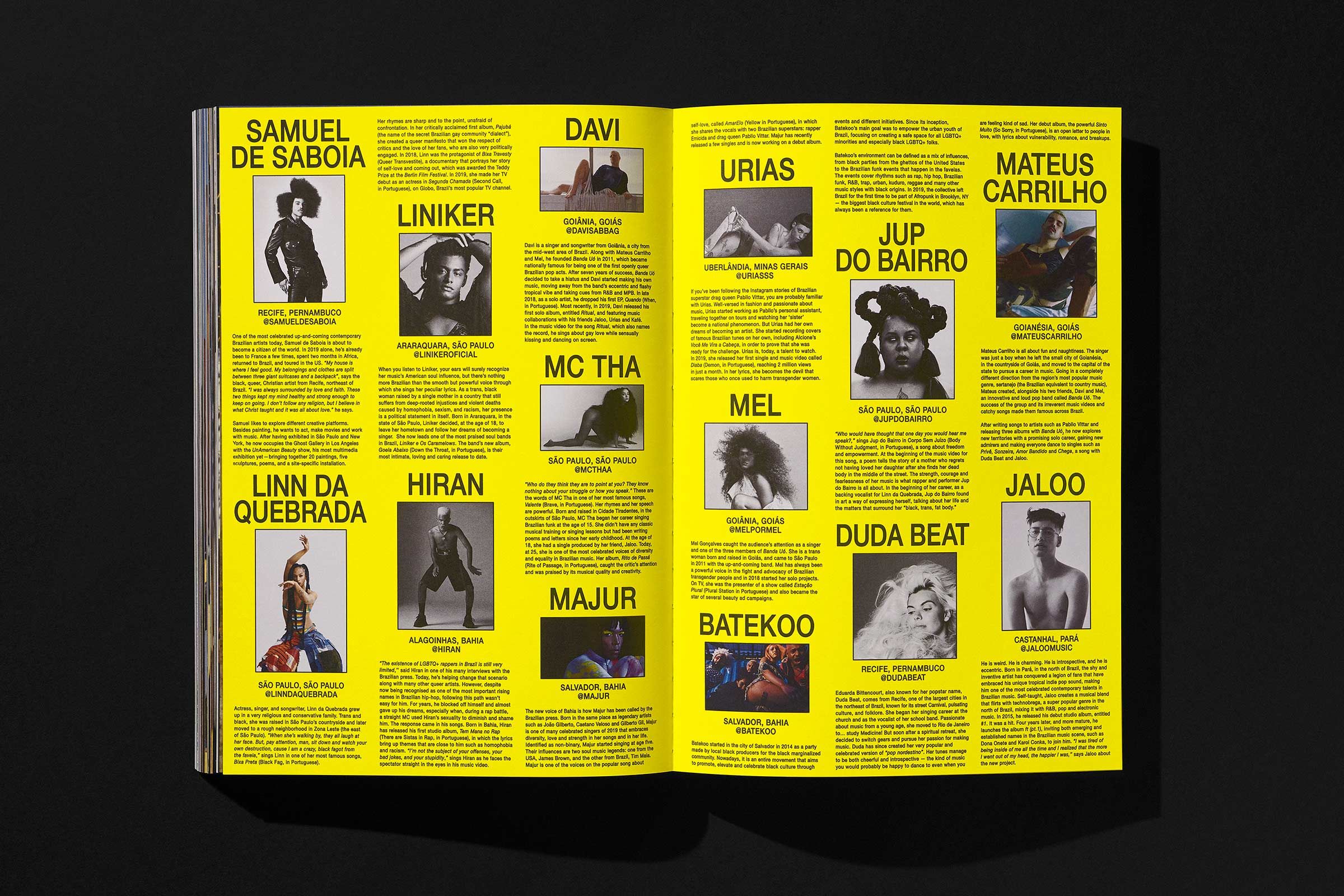
Samba: Archiving Resistance
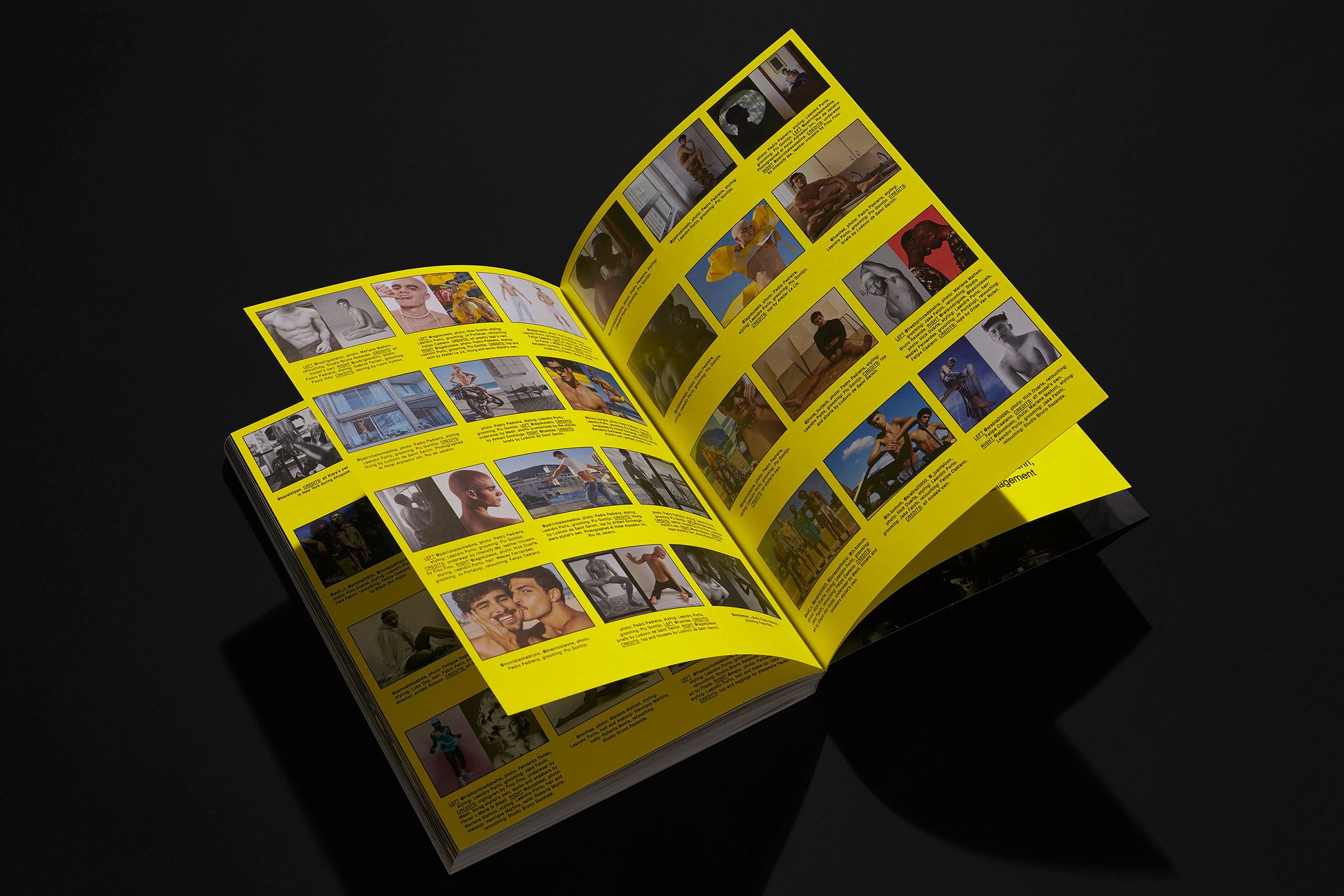
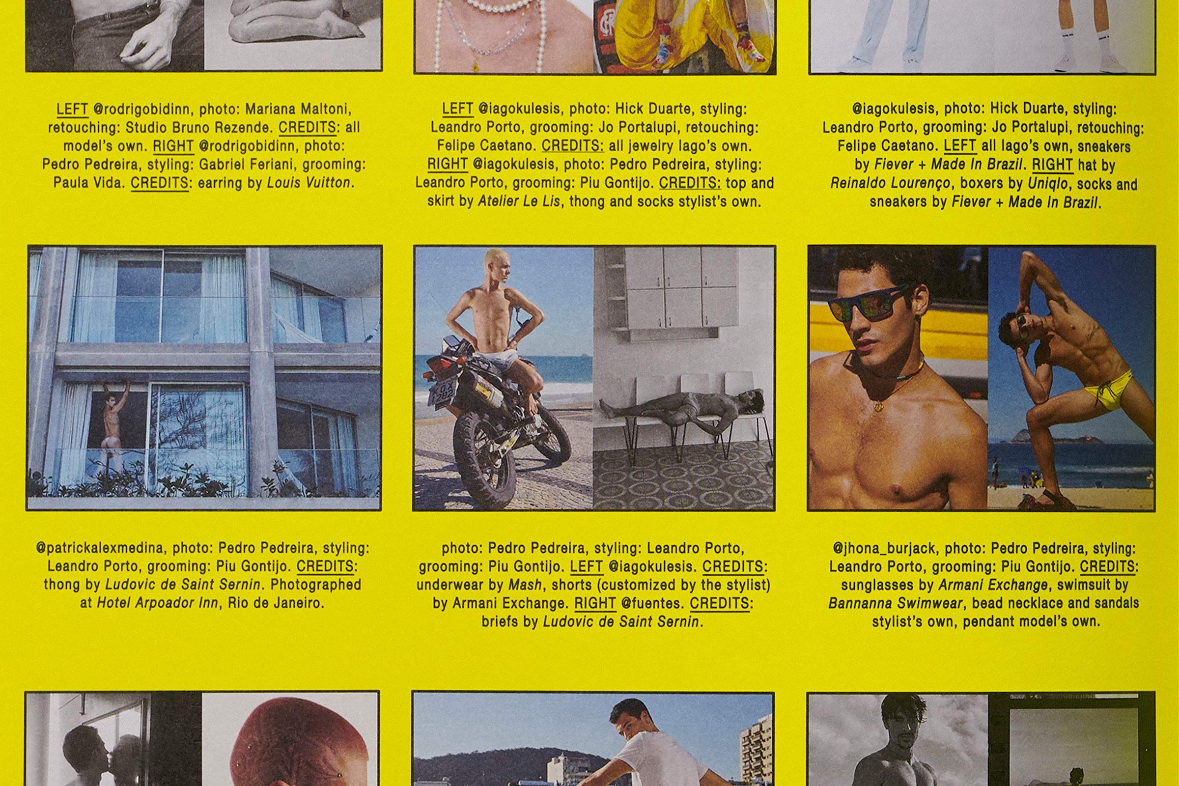
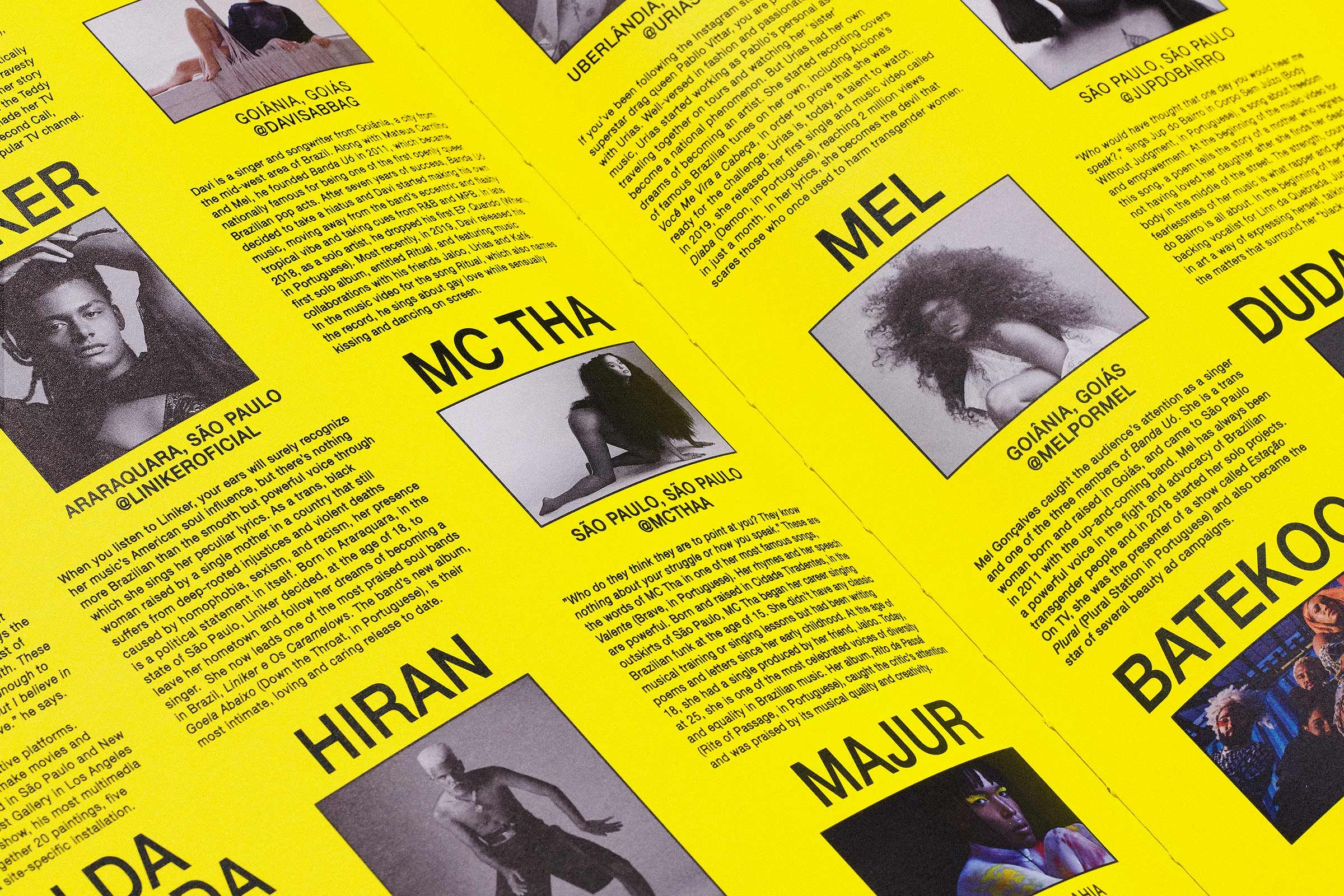
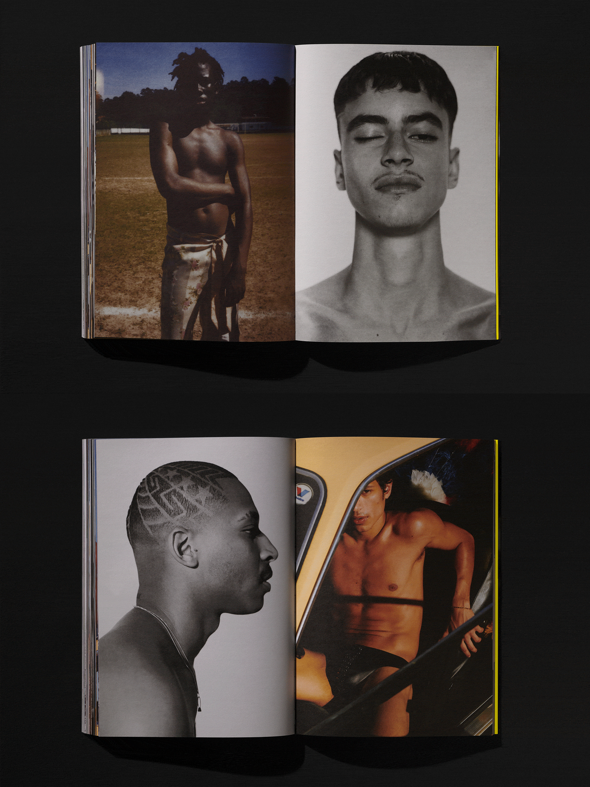
Conceived as a vibrant counter-narrative to political turbulence, Samba magazine manifests as a tangible beacon of Brazilian queer resistance. Porto Rocha’s design language channels a raw, urban urgency, utilizing a bold yellow palette and condensed typography reminiscent of utilitarian directories. This structured framework anchors a profound exploration of duality, exemplified by dual covers that capture artist Samuel de Saboia in contrasting states of fluidity and strength. By wrapping the logo vertically to ensure visibility from every angle, the publication asserts an unignorable presence, transforming a constellation of marginalized voices into a defiant, archival monument of hope.
View project